Balance: How Color Creates Stability in a Space
The fundamentals of interior paint design begin with balance. In well-designed homes, designers use paint as a design tool, not a final decoration, allowing it to quietly stabilize the room and support everything that follows.
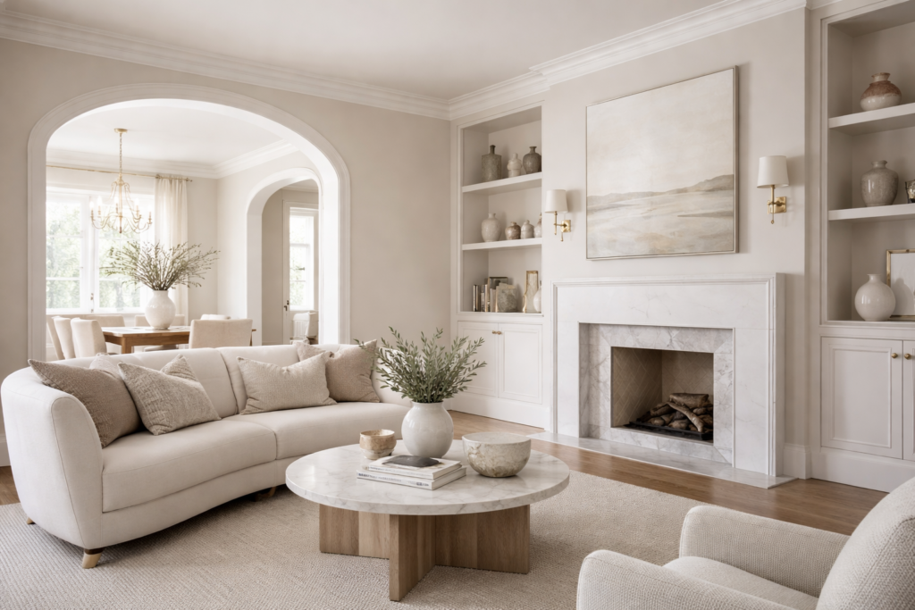
Balance is not about matching every surface. It is about distributing visual weight so the space feels settled rather than busy. Lighter tones can make a room feel open and breathable. Deeper tones can ground a space and make it feel intentional. The most refined interiors often use contrast with restraint, letting the architecture and light do the talking.
That level of finish depends on preparation, clean transitions, and consistency across surfaces, which is why professional painting services matter when the goal is a design-level result, not just a new color.
Flow: Using Paint to Guide Movement From Room to Room
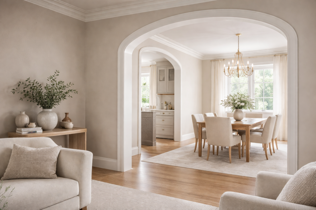
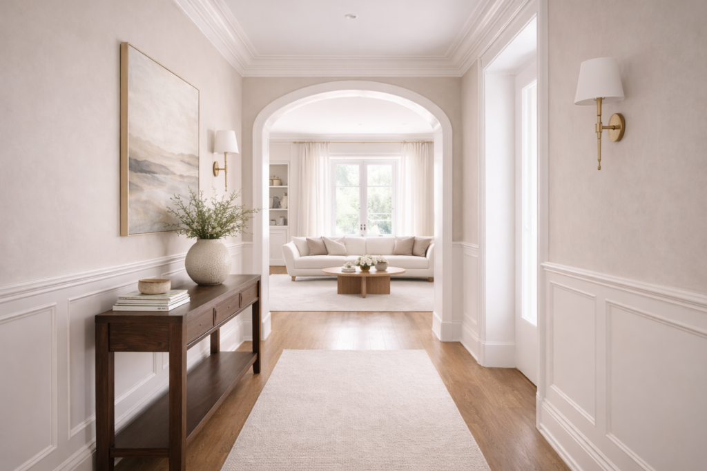
Designers think in sequences, not single rooms. Great interiors feel cohesive because paint choices consider how people move through the home and how each space relates to the next. Flow is what makes a home feel calm and composed as you pass through it.
Flow does not require every room to be the same color. Instead, it relies on thoughtful relationships, shared undertones, repeated neutrals, and consistent finishes that create cohesive interior spaces. When these elements are aligned, each room feels distinct while the home still reads as one complete design.
When paint planning supports flow, the home feels intentional without looking over-designed. It feels effortless, which is usually the point.
Visual Weight: Why Some Colors Feel Heavy and Others Recede
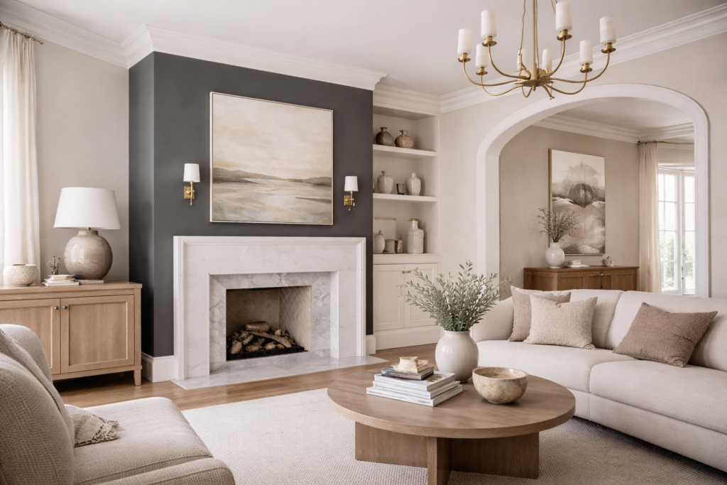
Visual weight is how much presence a color carries in a room. Some colors naturally pull the eye forward, while others fall back and support the composition. Designers use visual weight to control attention without needing bold statements everywhere.
In general, darker or more saturated colors carry more weight, while lighter or softer tones feel quieter. Finish also changes visual weight because it changes how light behaves on a surface. Choosing the right paint finishes can make a space feel softer and more refined, or sharper and more defined, even when the color stays the same.
When visual weight is handled well, paint doesn’t compete with the room. It gives the room structure.
Restraint: The Quiet Signature of Well-Designed Interiors
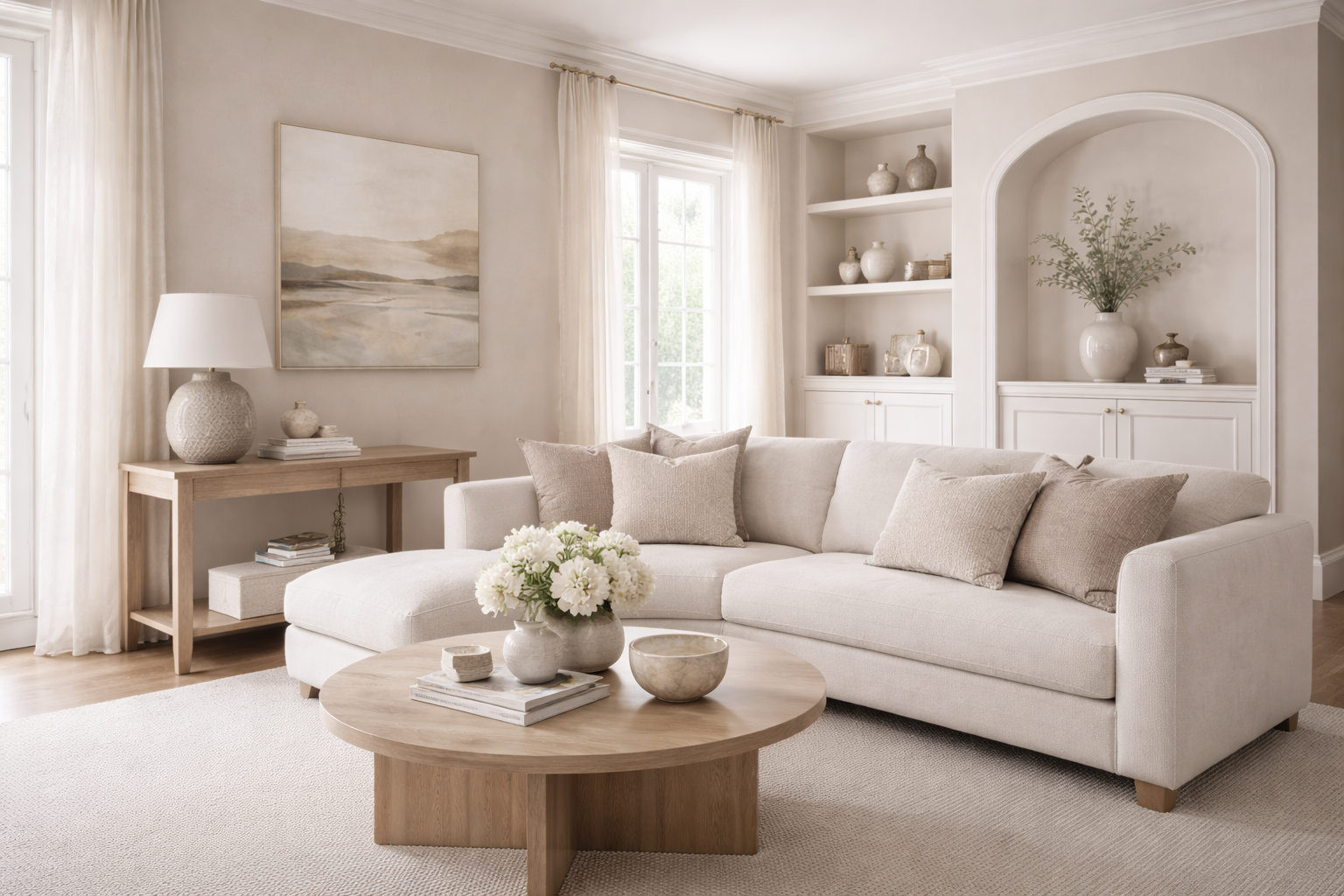
One of the most overlooked fundamentals in design is restraint. High-end interiors often use fewer colors than people expect, but those colors are chosen with intention and repeated with care. This is where design shifts from “painted” to “designed.”
Restraint also works because it respects how people actually live in a home. A calm palette supports light, furniture, art, and textures without fighting them. And when you understand color psychology, restraint becomes even more powerful because you can shape the feel of a home without turning every wall into a focal point.
Seeing Paint as Design, Not Decoration
The strongest paint choices are the ones that don’t demand attention. They create stability, guide movement, and shape perception. When paint is treated as part of the design, the entire home feels more intentional.
Balance, flow, and visual weight are not trends. They are fundamentals. When these principles are respected, paint becomes a quiet form of craftsmanship that makes a space feel elevated every day.
Like this:
Like Loading...