The Psychological Impact of Color in Interior Painting
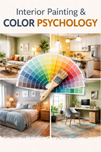
Interior painting does more than change the appearance of a room. Color influences emotional response, mental focus, physical comfort, and even biological reactions such as appetite and rest. When color psychology is understood before design decisions are made, interior painting becomes a tool that shapes how each space is experienced every day.
How Color Affects the Human Brain
Color is processed by the brain faster than shape, texture, or detail. The nervous system responds to color subconsciously, triggering emotional and physiological reactions without conscious thought. Warm colors tend to stimulate the brain, increase alertness, and create a sense of movement, while cooler colors slow mental activity and promote calm.
Saturation also plays a critical role. Highly saturated colors increase stimulation and intensity, while muted tones soften emotional response. Brightness affects energy levels, with lighter colors reflecting more light and darker colors absorbing it. Undertones determine whether a color feels warm, cool, or neutral, even when two colors appear similar on a swatch.
Interior painting decisions combine all of these factors, which is why color selection cannot be reduced to trend charts or sample cards alone.
Living Rooms and Shared Spaces
Living rooms and shared spaces are designed for comfort, conversation, and connection. Colors in these areas influence how relaxed people feel and how long they want to stay. Warm neutrals, balanced earth tones, and soft mid-range colors help create a welcoming environment without overwhelming the senses.
Excessively cool colors can make shared spaces feel distant or uninviting, while overly bold colors may create visual fatigue over time. The goal of interior painting in these areas is balance. A well-chosen color supports social interaction while remaining comfortable for daily use.
Finish selection also matters. Subtle sheens reflect light softly, enhancing warmth without glare.
Kitchens and Dining Areas and Appetite
Color has a direct psychological impact on appetite and social behavior. Warm colors such as muted reds, soft terracottas, warm beiges, and creamy whites stimulate hunger and encourage longer, more social meals. This effect is well documented in restaurant design, where color palettes are chosen to influence dining behavior.
Cool colors, particularly blues and gray-heavy whites, tend to suppress appetite. While they may look clean and modern, they can unintentionally make a kitchen or dining area feel less inviting. This does not mean cool colors should never be used, but they must be balanced carefully.
Interior painting in kitchens and dining spaces should align with how the room is used, whether it is a high-traffic family area or a more refined entertaining space.
Bedrooms and Restful Spaces
Bedrooms benefit from colors that reduce mental stimulation and promote rest. Soft blues, gentle greens, warm grays, and muted neutrals help slow the nervous system and create a sense of calm. These colors support relaxation and improve sleep quality by minimizing visual noise.
Highly saturated colors or strong contrast can interfere with rest, even if the space appears visually appealing. Dark colors can work well in bedrooms when undertones are controlled and lighting is considered carefully.
Interior painting in bedrooms requires attention to undertones, light exposure, and finish selection, not just the color name on the label.
Home Offices and Focus Areas
Focus and productivity are strongly influenced by visual environment. Greens and soft blues are known to reduce eye strain and improve concentration during extended periods of work. These colors create a stable visual field that supports mental endurance.
Bright whites and high-contrast color schemes may look clean, but they often increase fatigue over time. Glare and excessive contrast force the brain to work harder, reducing efficiency and comfort.
Interior painting in home offices should support sustained focus, clarity, and comfort rather than visual intensity.
Bathrooms and Wellness Spaces
Bathrooms are increasingly designed as personal wellness spaces rather than purely functional rooms. Color plays a significant role in how clean, calm, and comfortable a bathroom feels. Soft neutrals, light earth tones, and balanced whites create a sense of cleanliness without feeling sterile.
Cold whites or overly bright finishes can make a space feel harsh and uninviting. Warm undertones and softer finishes help create a spa-like environment that encourages relaxation.
Interior painting choices in bathrooms should balance brightness with comfort, especially in spaces with limited natural light.
Why Color Psychology Matters Before Design
Paint should never be an afterthought. Interior painting influences how lighting, flooring, cabinetry, and furnishings are perceived. Choosing paint colors after design elements are finalized often leads to compromise rather than cohesion.
When color psychology is considered early, design decisions become more intentional. Rooms feel cohesive, balanced, and aligned with how they are meant to function. Spaces that look finished but feel uncomfortable often suffer from poor color planning rather than poor design.
Interior Painting as a Design Tool
Interior painting is one of the most powerful design tools in a home. Color shapes emotion, behavior, and comfort in ways that go far beyond aesthetics. When chosen with intention, paint supports daily living, enhances well-being, and reinforces the purpose of each space.
Approached correctly, interior painting becomes part of the design process, not just the final step. The right color choices ensure a home feels as good as it looks.
Like this:
Like Loading...